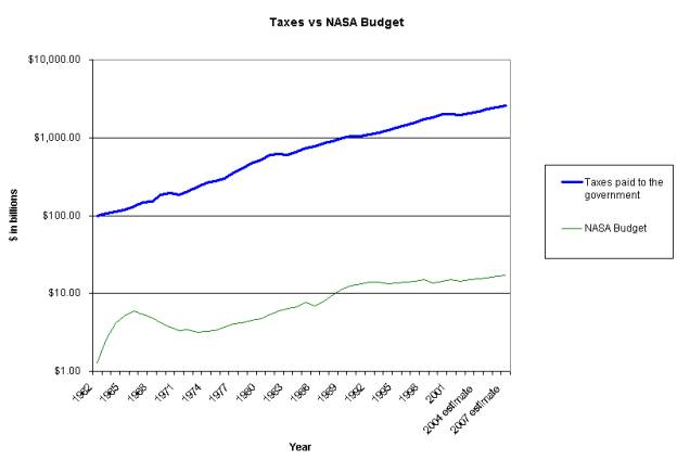
Figure 1: Taxes Received by the Federal Government vs. the NASA Budget
(Logarithmic Scale)
Playing with numbers
by Chad Lupkes
Political Science
POL 215
w/ Shabbir Karim
Important:
This article is a review of another article, and makes references
to graphs and
charts that are on the other page. Please read this article first.
The Colony Fund is a new investment company that plans to begin offering opportunities for small investors to assist in the development and industrialization of the final frontier. They have a website <http://www.colonyfund.com/index.html> that outlines their opinions and their plans in general detail. One of the pages on this website explains why the US Government is no longer capable of providing the funding for the next generation of space projects. The article reviews some of the basic numbers from the US Federal Budget, and gives the author, Thomas Olson, a chance to present his interpretation of those numbers. Although an interpretation of data should not be considered wrong, and the numbers help him present his case, the article is written from only one side of the story. The numbers come from the published data for the US Federal Budget, available on the Internet for downloading. This review will present some of the facts behind the numbers, and will dig deeper into those numbers to find some interesting conclusions.
The core of the article is a series of graphs, each building on the previous. The first one shows "Taxation as % of total US GDP", and shows an average of 18.3% from 1970 to 2000. The published data can actually take these numbers back to 1930, but for most of my graphics in this article review, I was only able to gather consistent data for all of the data points back to 1962, and out to what is projected for 2007. For that range of years, the average is 18.4%. What I found equally interesting is that the average "outlay", which means the amount of money paid out by the Federal Government, is actually higher than that, at 20.2%. This means that our government has consistently paid out more than it has been taking in. In fact, if you take an average of the surplus/deficit numbers for the period of 1962 to 2007(projected), the number is –1.8%.
The second graph shows the budget of the National Aeronautics and Space Administration (NASA) as a percentage of total outlays. Because the two lines on the graph are both percentages, it makes sense, but not as much as it might if the exact same scale was used. Here is a graph that presents the two numbers in dollars as they compare to each other. Because the numbers are so vastly different, the only way to show them both on the same graph is to make the vertical axis a logarithmic scale. This in itself reveals that taxes have been increasing geometrically. You can see the boost that the race to the moon put in the NASA budget during the mid-1960’s, and that after the ‘70’s shortfall that the budget has been slowly growing.
|
(Logarithmic Scale) |
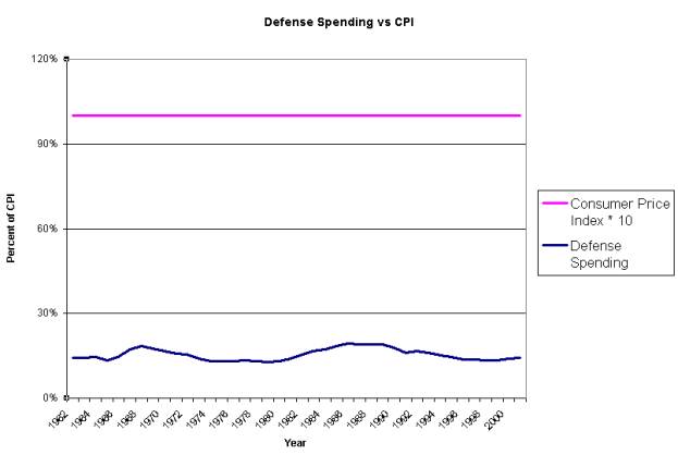
The next graph in the article adds a third item, Defense spending as a % of outlays. Again, because all three data points are using a percentage, it shows a "drop" in spending compared to the other destinations for the money. The author points out that the numbers are pretty much the same if they are adjusted for inflation. This is an interesting proposal that needs clarifying. I found a chart of the Consumer Price Index from 1962 to 2001, and I came up with Figure 2. This graph shows that if the CPI is multiplied by 10, and then used as a comparison point for the amount of money spent on Defense, then the amount of money is almost exactly the same now as it was in 1962.
|
(Vertical scale is percentage of CPI*10) |
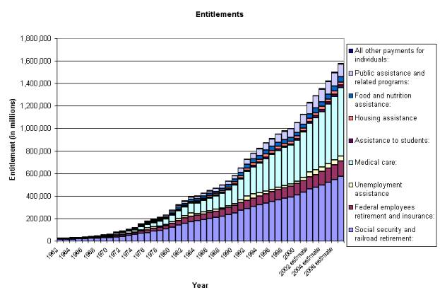
The final graph in the article describes the "one word" that has killed the US Government’s ability to commit the necessary resources to space exploration and colonization. That word is Entitlements. According to Dictionary.com, an entitlement is "a government program that guarantees and provides benefits to a particular group." The budget information has quite a bit of information about the entitlements paid out to individuals, and I did some additional research to find out where the money was going, and if the numbers presented were accurate. They were. Figure 3 is a graph of how much money has been sent out as entitlements since 1962, and for what purpose.
|
|
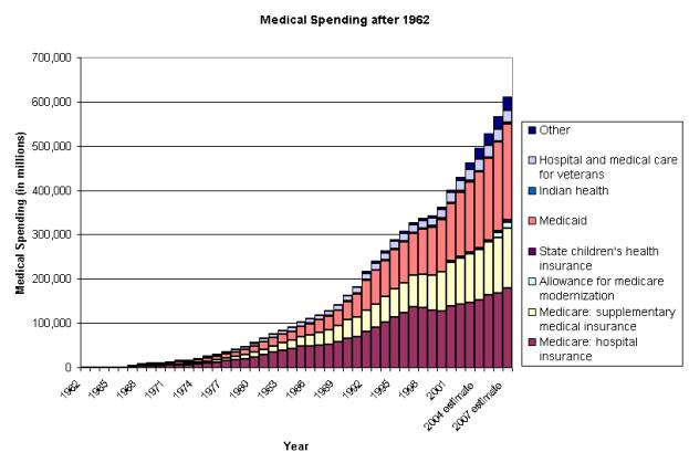
Figure 3 gives a very clear picture of where our tax dollars are being spent. This was so revealing that I decided to drill down further into the data. Medical care is a very general term that refers to Medicare, Federal supplements to State children health insurance, Medicaid, Indian health costs, hospital and medical care for veterans, and a few other minor expenses. Figure 4 is a graph that looks only at medical expenses.
|
|
Thomas Olson’s article showed four graphs and some conclusions based on those graphs. His conclusion is that because of these expenditures, our government can no longer spend the money that it would take to finance Space Exploration and Colonization. The numbers show that his conclusion is correct, and that we might have even bigger problems on the fiscal horizon.
Playing with numbers like this can reveal some interesting facts about how our government is spending money and what the results of that spending might be. And the more that we learn about what the problems are, the better equipped we are to find a solution.
References
Olson, Thomas Andrew, "Could the U.S government afford to "go it alone" to Mars, like we did the moon?" Colony Fund website. Retrieved on October 5th, 2002 from http://www.colonyfund.com/Viewpoints/Archives/entitlements.html
Budget of the United States Government, Historical Tables. Retrieved on October 5th, 2002 from http://w3.access.gpo.gov/usbudget/fy2003/hist.html
Consumer Price Index data from the Bureau of Labor Statistics website, retrieved on October 5th, 2002 from http://www.bls.gov/cpi/
Entitlement definition from Dictionary.com, Retrieved on October 6th, 2002 from http://www.dictionary.com/search?q=entitlement&r=2
If you are interested in looking at the source file that generated these graphs, you can find it at the link below: